
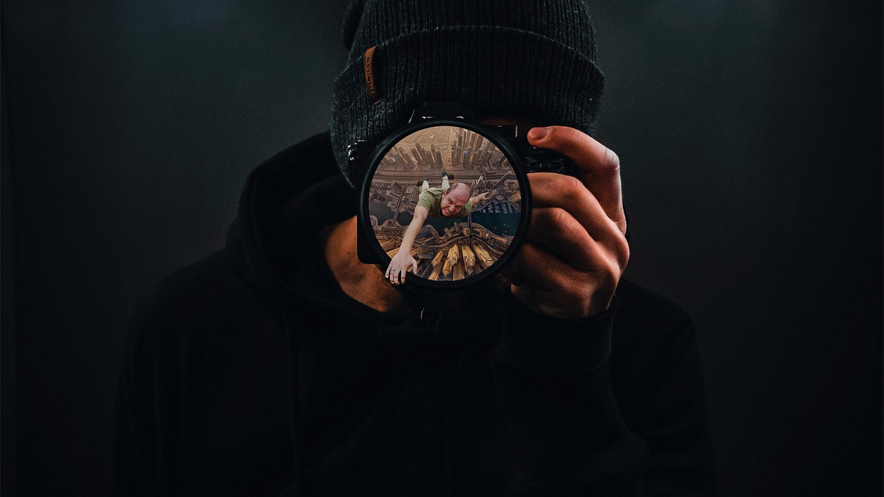
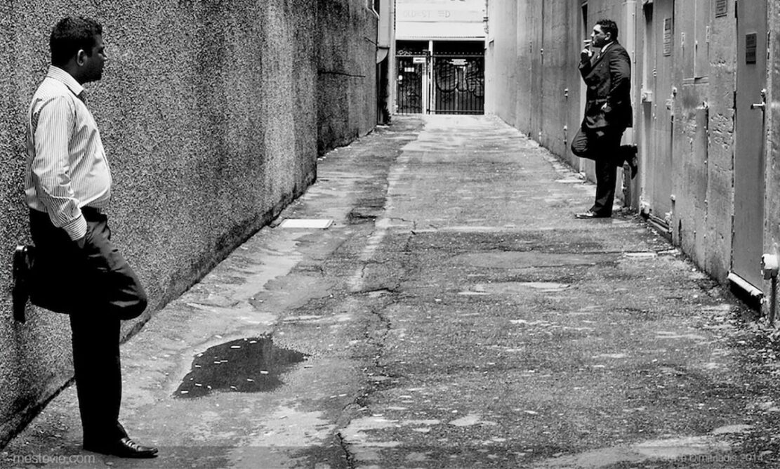
Color in street photography is a highly controllable tool that shapes the mood of a shot, directs attention, and establishes a visual rhythm. Unlike studio photography, street color can’t be “created”—it can only be seen, identified, and used. The better a photographer understands color relationships, the easier it is to create expressive images without complex editing. Below are specific techniques for working with the palette consciously.
Using color contrasts: where to look for pairs that “hold” the frame
In the street, contrasting pairs are less common than you might think. Red and green, blue and orange, yellow and purple—these aren’t random coincidences, but the result of choosing the right angle and time of day. What helps find strong color pairs:
- Choosing the hour—at sunset and sunrise, a warm palette “flashes,” interacting with cool shadows;
- Finding objects with a dominant color—a bright jacket, a sign, a bus, graffiti;
- Changing the shooting angle—sometimes a step to the right removes visual noise and leaves a pure, contrasting pair.
Color contrasts work the same way as visual triggers in digital environments—for example, in gaming interfaces like online casino interfaces, where bright accents of black and yellow or purple and red direct the player’s attention. A street photographer does the same, only with real-life objects.
Monochrome Scenes: When “Little Color” Brings More Expression
Monochrome scenes are often found in cities with cool architecture: concrete, glass, and metal. When the surrounding environment is immersed in a gray-blue palette, it becomes possible to build the frame on subtle tones, textures, lines, and soft transitions. To make monochrome work:
- Remove random bright objects from the frame;
- Shoot on a cloudy day or in the shade—this evens out the palette;
- Emphasis on depth: Monochrome scenes benefit from layered composition.
The described shots look especially good in large series where a unified tone is maintained.
Color as a Structural Element: Working with Repetition and Rhythm
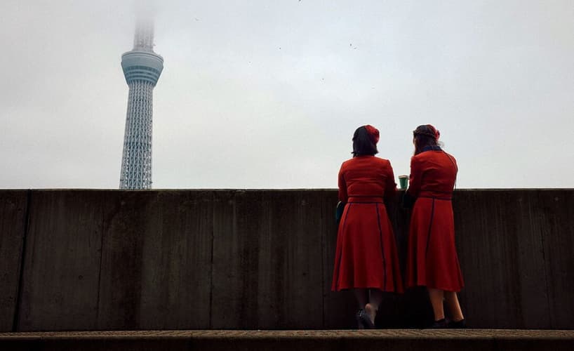
Color helps structure a scene when used in repetition. For example: three identical yellow windows, rows of brightly colored bicycles, or red clothing items against neutral walls. Repetition creates a rhythm that brings the frame together. To ensure rhythm works:
- Look for duplicate color elements;
- Adapt to movement—a successful repetition can appear for a second;
- Keep the frame free of distracting details.
Color rhythm is essentially visual music, created by the photographer through observation.
Color Spot: Directing Attention Through a Single Bright Object
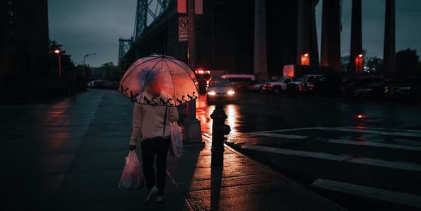
The simplest and most powerful tool in street photography is the color spot. When the entire frame is calm, one bright accent (a yellow umbrella, a red bag, a blue bicycle) instantly becomes the focal point of the composition. Works best:
- on neutral backgrounds (concrete, asphalt, building shadows);
- in shots with minimal depth of field;
- in motion—a running person wearing a brightly colored item of clothing enhances the dynamism.
This can create expressive shots even without complex scenes.
Color and Weather
In street photography, weather acts as a natural filter, determining how saturated or muted the colors will be. On a clear day, contrast is enhanced, shadows become bluer, and warm tones are sharper. On cloudy days, the palette softens, and colors shift to a range of soft pastels, creating a calmer and more cinematic scene. To use weather effectively:
- On sunny days, look for objects with vibrant, localized colors—signs, storefronts, cars;
- In fog, focus on silhouettes and muted color transitions;
- After rain, use reflections—wet asphalt enhances the saturation of blues, reds, and greens;
- During golden hour, choose scenes with warm tones—brick buildings, graffiti, clothing with orange accents.
The color of weather acts as a dynamic palette that cannot be reproduced in the studio—and that’s precisely why it’s so valuable.
Color in Series: How to Maintain a Consistent Style
When a photographer works in series—for example, projects about a city, people, or space—the key factor is not a single shot, but the overall palette. A series looks professional when it has a consistent color theme: the dominance of one hue, the repetition of two or three colors, or a strict gradation of warm and cool. Tips for creating visual cohesion:
- Choose one color theme—for example, warm orange + cool blue;
- Avoid random, strong accents that break the overall rhythm of the series;
- Shoot at the same time of day if you want a unified tone;
- Use the same white balance or preset, but minimally;
- Collect shots with a similar atmosphere, even if they depict different subjects.
Practical Checklist: How to Improve Your Color Workflow Today
The following checklist provides practical techniques to help you improve color control and achieve consistent results in your street photography:
- Start with color, not the subject—look for a palette first;
- Pay attention to reflections—glass enhances saturation;
- Shoot at a low ISO to maintain color purity;
- Use manual white balance—automatic white balance often distorts cool scenes;
- Introduce one dominant hue into a series to achieve visual cohesion.
Controlling color effectively is one of the most powerful ways to enhance your street photography. By paying attention to hues, reflections, and color balance, you can create images that feel cohesive and visually striking. Small adjustments in your workflow—like choosing the right palette, managing ISO, or setting white balance manually—can make a significant difference in how colors are perceived.